Overview
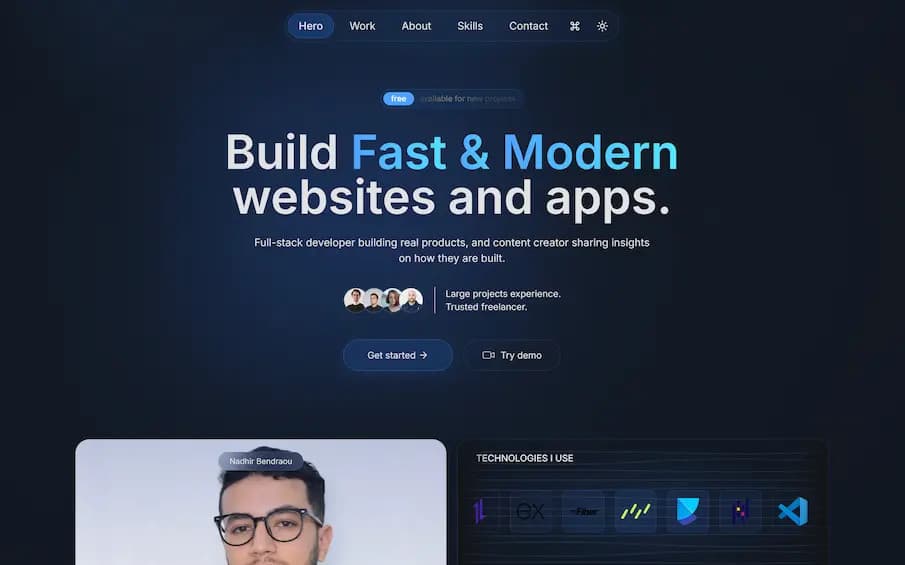
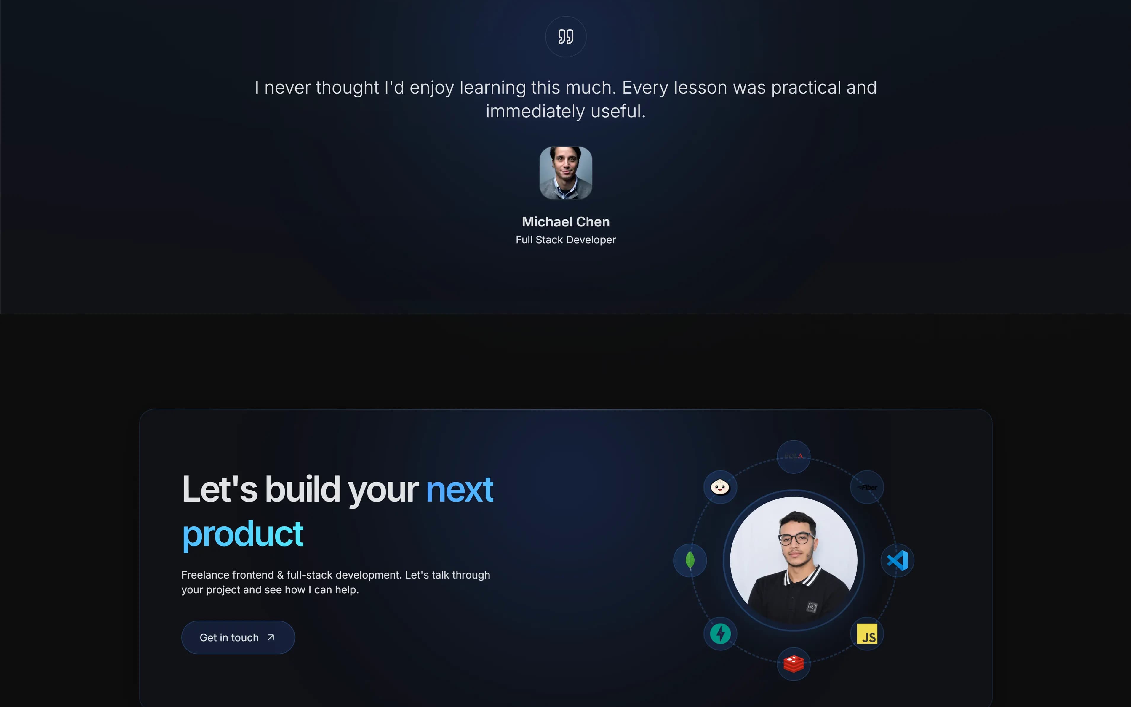
A previous portfolio build used to explore a more expressive direction: a dark dotted landscape, large typography, animated theme transitions, and a compact work list. It brought together a command menu, a hero with floating technology icons, project previews, testimonials, and a contact section. I never finished it. Halfway through, I kept second-guessing whether it was interactive enough or good enough, and the scope kept growing until I moved on. It never made it to production, but the interaction work carried forward into the portfolio I finally shipped.
Motion & interaction
Motion was used to give the page a sense of depth rather than to decorate it. Sections reveal as they enter the viewport, project rows respond to hover, and the theme toggle animates a circular reveal with the View Transitions API. The effects degrade gracefully when reduced motion is requested or the API is unavailable.
- Scroll-triggered reveals with Motion
- Animated theme toggle using document.startViewTransition
- Hover previews that follow the project list
- Reduced-motion fallbacks for the main transitions
Interface details
The hero combines a dotted world map, soft light rays, and a floating technology cluster around the portrait. Navigation collapses into a command menu for quick jumps between sections, while project entries open into article-style pages with long-form notes and screenshots.
Why it never shipped
This build never made it to production. I would get halfway, decide it wasn't interactive enough or polished enough, and start rethinking the whole direction instead of finishing the version in front of me.
The hard part wasn't the code. I was using the portfolio to prove too many things at once. The current portfolio finally shipped because I narrowed the scope and accepted that a focused site is better than an unfinished impressive one.
The project taught me that taste without a finish line just becomes another restart.
What carried forward
The older portfolio was a useful constraint: it proved which interactions were worth keeping and which were noise. The command menu, the dark-first theme, and the project-first structure survived into the current portfolio, while the heavier visual effects were scaled back for clarity and performance.
The best parts of this build were the parts that made navigation faster, not the parts that made the page move.
Screenshots
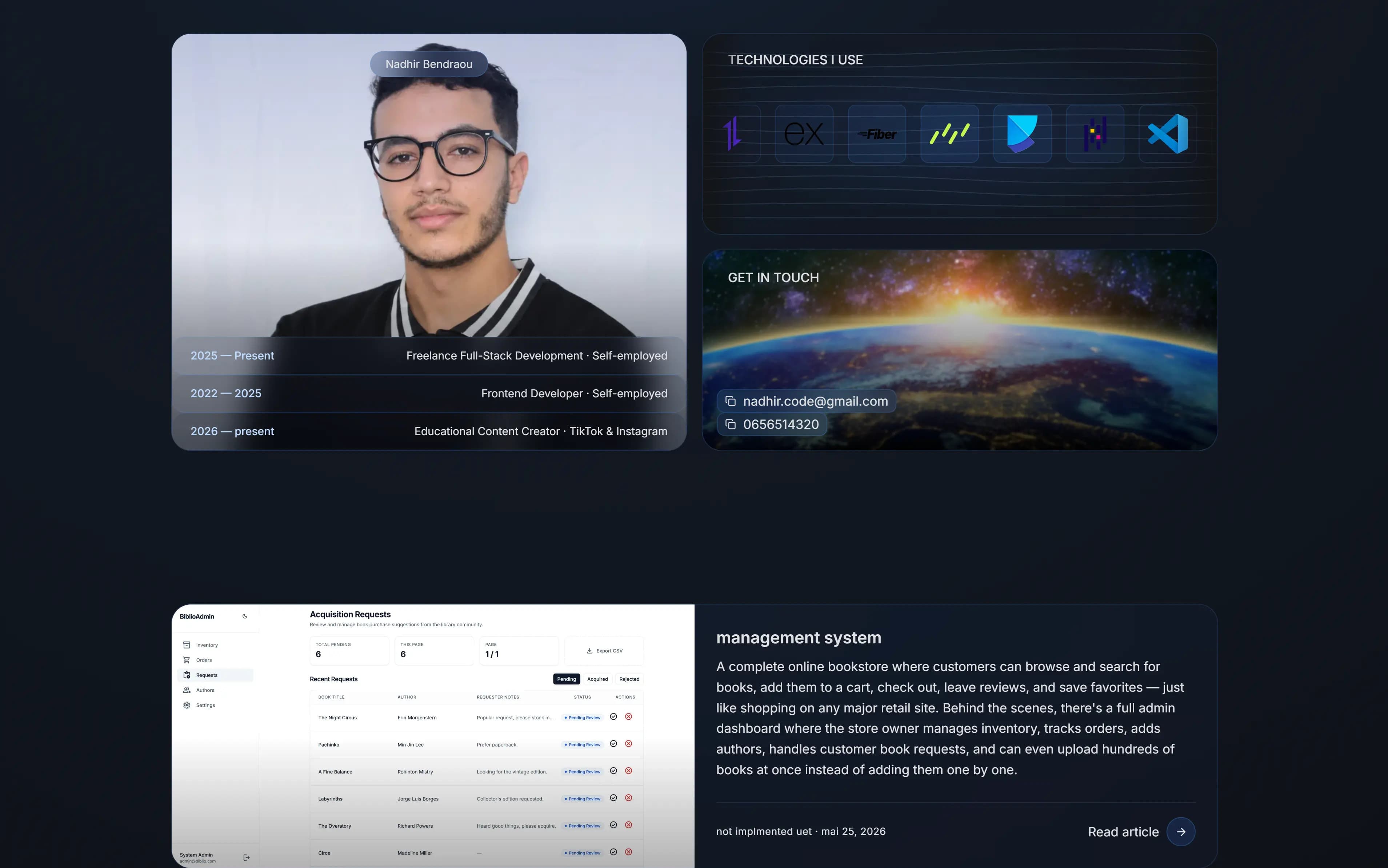
What it includes
- Animated theme toggle with view-transition shapes
- Keyboard-driven command menu
- Scroll reveals and hover project previews
- Dotted map and layered hero lighting
- Compact work list with article-style case studies